

Overview #
Templates in Stride serve as reusable blueprints for creating and managing personalised experiences. They allow users to define the structure, appearance, and behaviour of various experience components, eliminating the need to manually code each variation from scratch. Stride templates are highly flexible, supporting HTML, CSS, JSON Schema, and Config JSON, making them adaptable to different platforms and display settings.
By using templates, marketers and developers can quickly deploy and preview experiences across multiple devices without worrying about inconsistencies.
This guide walks through the process of creating a template in Stride, covering everything from defining its structure to previewing and saving the final version.
The Steps #
Before creating a new template, you need to navigate to the manage templates section in Stride.
After logging in, the Stride dashboard presents a navigation menu on the left side of the screen. Locate and expand the Experiences section, then select manage templates.
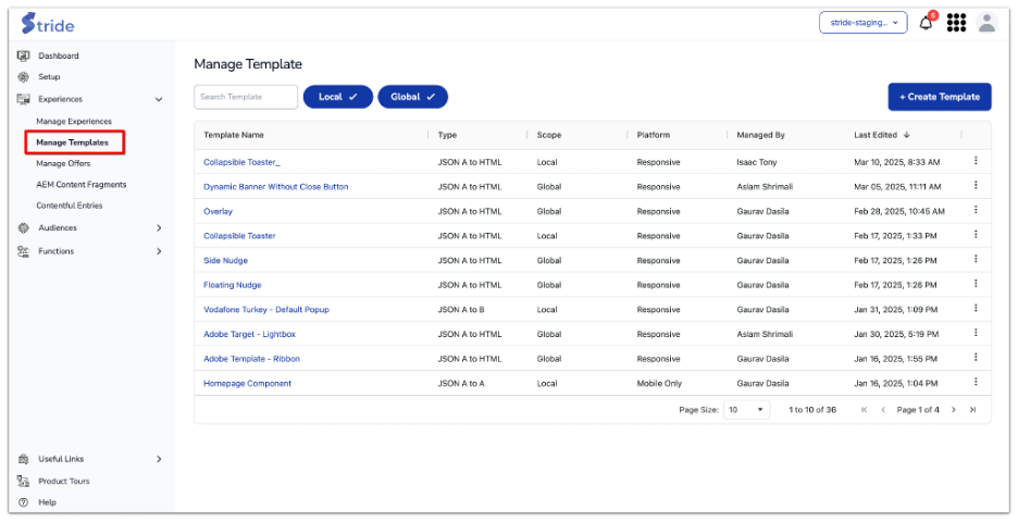
This page provides an overview of existing templates, displaying their name, type, platform, and last edited date. Here, you can either modify an existing template or create a new one.
Creating a Template #
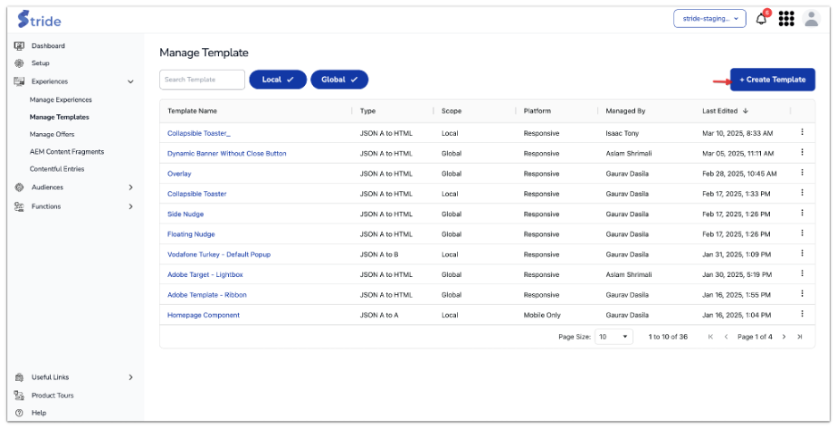
To start the creation process, click on the “+ Create Template” button at the top-right corner of the page. This opens a new screen where you can define the template’s properties and customise its content.
Once on the template creation page, the first step is to give your template a meaningful name. This name will help you and other users easily identify its purpose. Enter a descriptive name in the “template name” field.
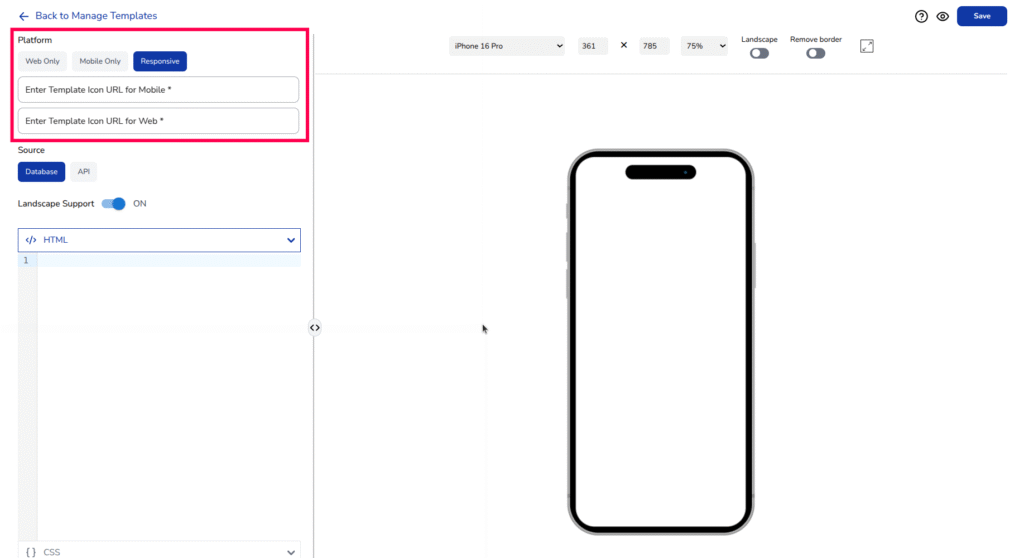
Choosing a Platform #
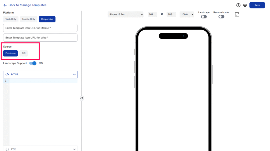
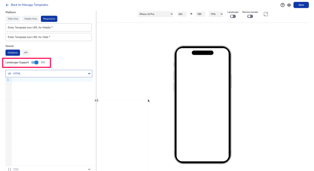
After selecting the type, you need to choose a platform for your template. Stride allows you to designate whether the template should be Web Only, Responsive (adapting to different screen sizes) or Mobile Only (optimised specifically for mobile devices). If the experience should be available in landscape orientation as well, enable the landscape support toggle.
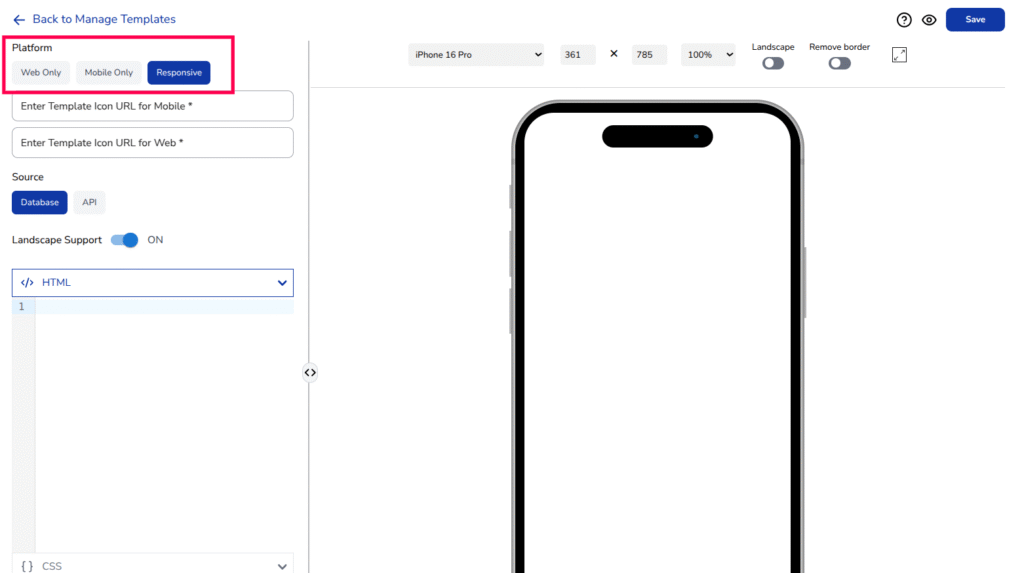
Based on the Platform selection, It will show textbox to add template icon URL.
For example,
When selected platform is “Web Only” or “Mobile Only”, It will ask to add source URL of image showing how the template looks like on corresponding platform.
when selected platform is “Responsive”, It will ask to add icon image URL for both web and mobile platform.
Template Icons URL are used in the choose template Gallery view UI while creating new experience. This helps user to easily identify target template based on its look
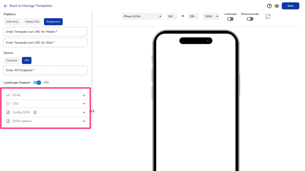
The next step is choosing a data source. Stride templates can pull data from an API endpoint or dynamically fetch content from a database. If your experience requires dynamic elements such as personalised offers or real-time updates, selecting Database as the source is recommended.
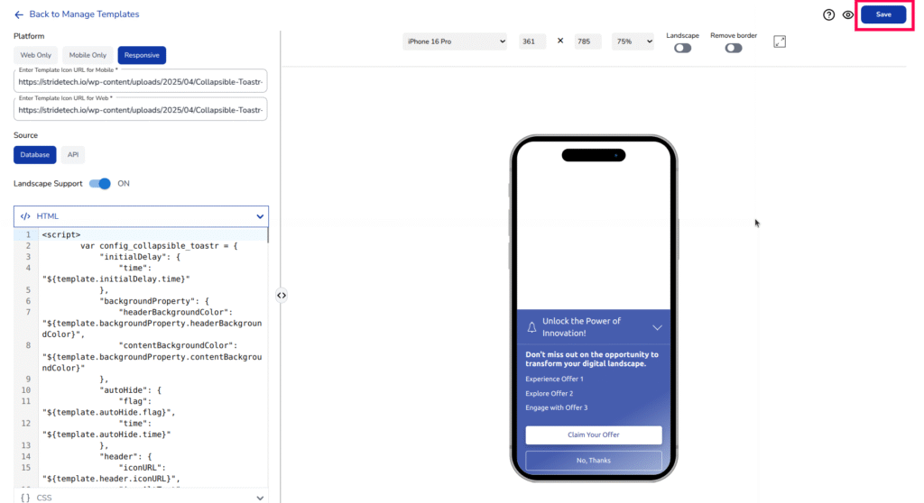
With the template’s foundational settings in place, it’s time to define its content and structure using various code inputs.
- HTML section
Defines the template structure and logic, including JavaScript for dynamic elements, user interactions, and auto-hide functionality. - CSS section
Controls the visual styling, including colours, fonts, button designs, animations, and responsiveness across devices. - Config JSON section
Provides configurable parameters for text, colors, timing, and button styles, with validation rules to ensure valid inputs. - JSON schema section
Defines the structure of configurable properties, ensuring consistency and validation of template settings.
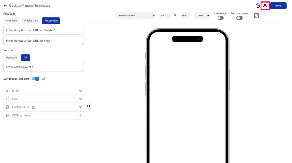
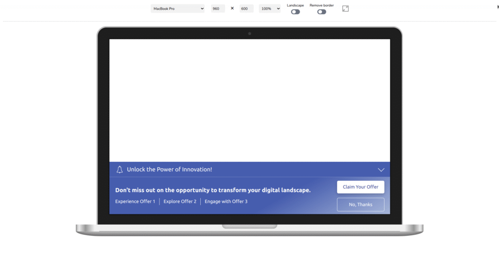
Before saving, it is important to preview how the template will look across different devices. Stride provides a real-time preview panel where you can see the template’s appearance and make adjustments.
Click Apply changes Icon button to preview.
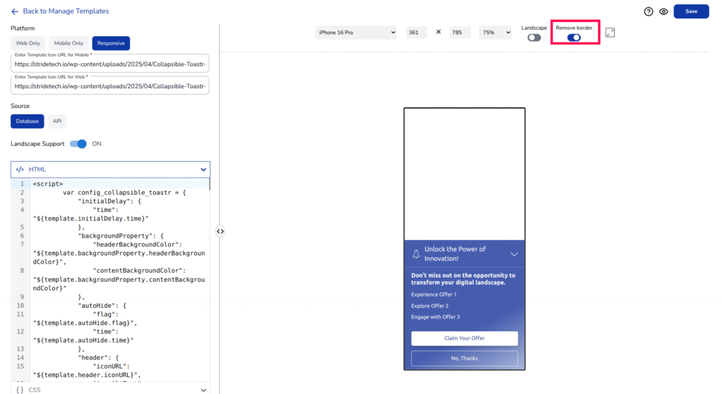
At the top of the preview panel, you can:
- Select a device from a dropdown menu (e.g., iPhone 16 Pro, Samsung Galaxy S24, MacBook Pro, iPad Mini, etc.).
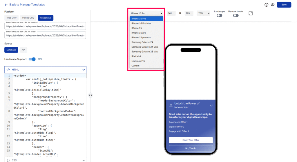
- Adjust the zoom percentage to allow larger screens to fit the display window.
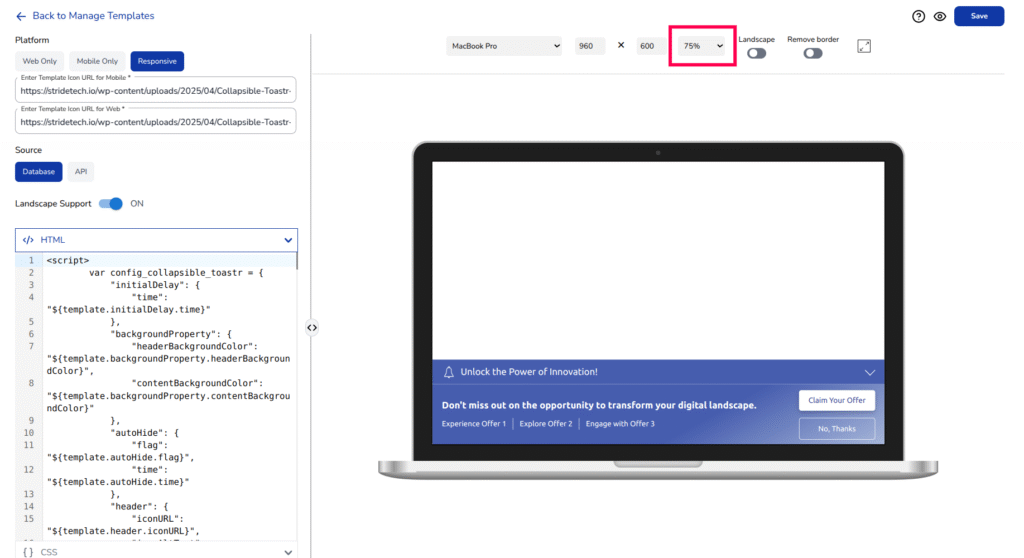
- Toggle landscape mode to test responsiveness.
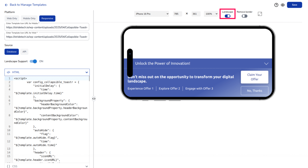
- To disable/enable the Landscape mode for mobile template, Toggle the Landscape Support switch.
- Enable or disable the border to view the template without additional interface elements.
Toggle the full-screen view to the template in fullscreen.
If adjustments are needed, modify the code in the respective sections and click “Apply Changes” Icon to update the preview.
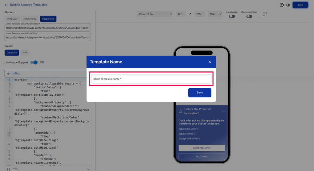
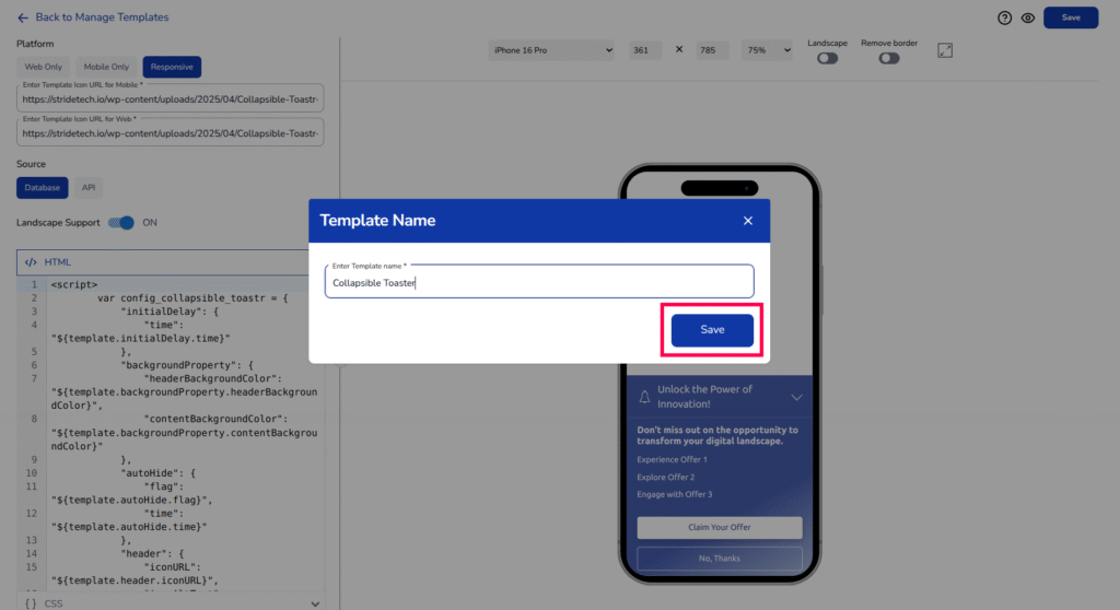
Saving the Template #
Once you are satisfied with the template’s appearance and functionality, finalise the process by clicking the “Save” button.
- A modal will open asking to add the template name
- Add appropriate template name in the textbox
- Click on “Save” to complete the create new template process.
The template is now stored in Stride and will appear in the manage templates list, where it can be edited or reused for future experiences.


